What a booker looks for in the first seconds on your site
People who book open many sites a day. What they must find without searching, and what makes them close the tab.
 By Joan Subirats, founder of The Jazz Passport6 min read
In this article
Someone who books for a venue, a festival or an agency opens a lot of musicians’ sites in a day. They do not read them. They scan each one for a handful of answers, and if the answers are there, they keep going. If they have to hunt, they close the tab and open the next site. There is no ill will in it. There are simply too many sites. This guide covers what a booker has to find without searching, and what makes them leave.
What they look for, almost always in this order
Who you are
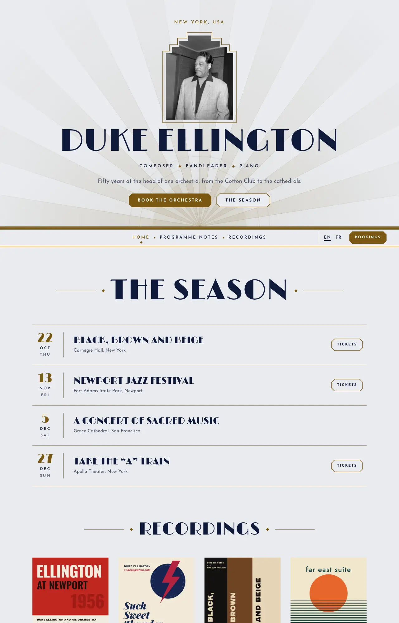
The first screen, before any scrolling, has to say who you are and what you do. That means your name or the band’s, the line-up or the instrument, the style in a few words and, ideally, where you are from. A line like "Welcome to my website" takes the place of that sentence and tells them nothing.
A photo helps when it shows something about the project, such as the whole band, the instrument or a stage. A portrait so dark that nobody can be recognised does not help.
What you sound like
Once they know who you are, they want to hear you, and they want it one click away, not three. Put a player on the home page, or a clear button that leads to your music. If you are not sure how to set that up, how to put your music on your site walks you through it.
What you are like live
A programmer is booking a concert. A live video of a whole tune with good sound answers the question that matters most to them: what will happen on their stage?
Whether you are active
Dates show that the project is alive. A list of upcoming gigs carries more weight than a long history, even if the list is short. If you have no dates right now, a section about what is happening is better than an empty list.
How to book you
The booking button or link should be visible from the moment the page opens. Behind it there should be a form or an email address. Someone who comes to your site meaning to book you should not have to search for how to do it.
What people say about you, and where you are
This is press, the festivals you have played and a line from a review. It is also the city you travel from, which for a programmer is part of the budget.
What can wait
Everything else matters, just not in the first seconds. The long bio, the full discography, the photo gallery, the press archive and the tech rider are for someone who has already decided to keep looking. By then they will find them, as long as the menu names them clearly.
The usual mistake goes the other way: trying to make the home page say everything. A long text at the top pushes down what decides the booking, which is your name, your music and the booking button. The home page is a summary with clear paths to the rest. The full press kit sits at the end of those paths.
On the phone too
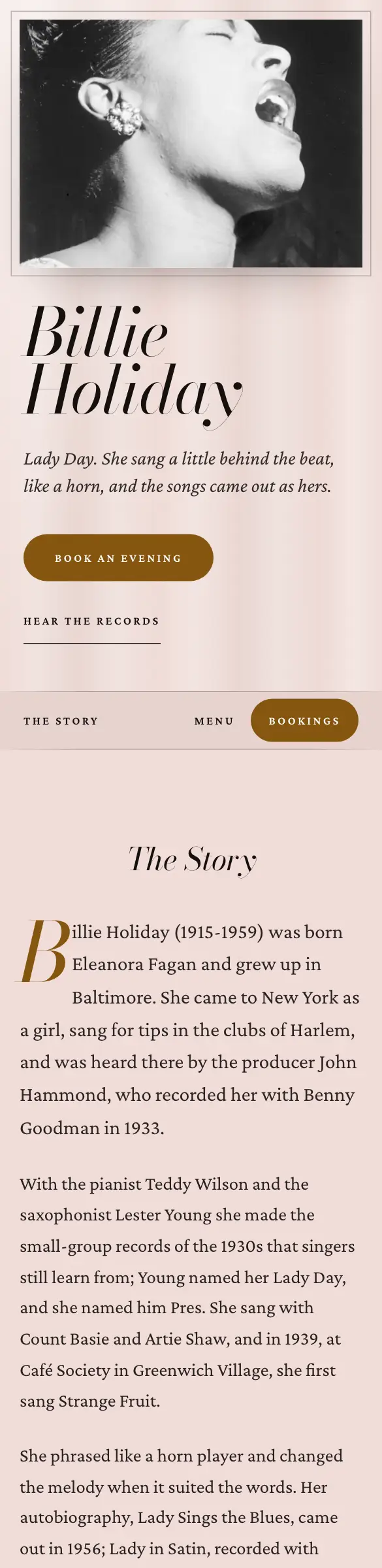
Many people open your site on their phone, often from a link that came by email or message. What works on a computer can break on a small screen. The name may not fit, the menu may cover the home page, or a button may be too small to tap.
Open the site on your own phone with the wifi off. Check that the name, the sentence and the booking button all show on the first screen.
What makes them close the tab
Some mistakes get no second chance. They are not serious in themselves. There is just always another site waiting.
- Music that plays by itself. A programmer often has several tabs open and may be in an office or a meeting. A sound they did not ask for is the quickest way to get your tab closed.
- A broken player. A link to a withdrawn record, a video that no longer exists or a player that never loads all make the site look abandoned.
- Old dates, or none. If the latest date is from two years ago, it looks as if the band no longer exists.
- Hidden contact. This means only a link to social media, an email address inside an image that cannot be copied, or a form at the bottom of a long page.
- Outdated content. A line-up that is no longer yours, a "new record" that came out years ago or a bio that stops in another era all tell the visitor the site is stale.
- Things in the way. A front page that asks you to "enter", an intro animation, a sign-up window before anything shows, or photos so heavy that the page takes ages to appear.
What helps
- Name, line-up and style at the top, no scrolling
- Your music one click away
- A live video of a whole tune
- Upcoming dates, even a few
- A booking button always in sight
What makes them leave
- Music that plays on arrival
- Broken players and videos
- Dates from years ago
- Contact only through social media
- A front page that asks you to enter
Before your site: what the search engine shows
Often the programmer does not arrive through a link. They search for your name, and the first thing they see is the result. It shows the title, the description and, if your site publishes them properly, your upcoming gigs as events. Some of their questions are answered before they click.
Run the test
Ask someone who does not know your project to open your site on their phone. Give them half a minute, then ask four questions: who is it, what does it sound like, when is the next gig and how do you book? Whatever they cannot answer is what you need to move up the page.
Run the test again every time you change something important. Run it every few months even if you change nothing, because links break on their own.
How Pages handles it
In Pages, every site presents your identity card: your name, roles, instruments and town. The dates you enter in the Calendar show on the site and are published as events that search engines can read. Embedded players and videos load only when someone clicks them. The booking form sends each request to the Studio Inbox and to your email. Health checks the published site, including what a booker sees, and each warning takes you to the place where you can fix it.
To go through the whole site piece by piece, continue with what a musician’s website needs.
Your site, without the website work. Ask for your invitation.
Pages is the site and the Studio for musicians by The Jazz Passport. The technical side is done; you bring the music.