Why your site’s CTA leads to your contact
Your site is the one place where someone can book you. Why in Pages the CTA and the menu always lead to your contact, and what the research says.
 By Joan Subirats, founder of The Jazz Passport6 min read
In this article
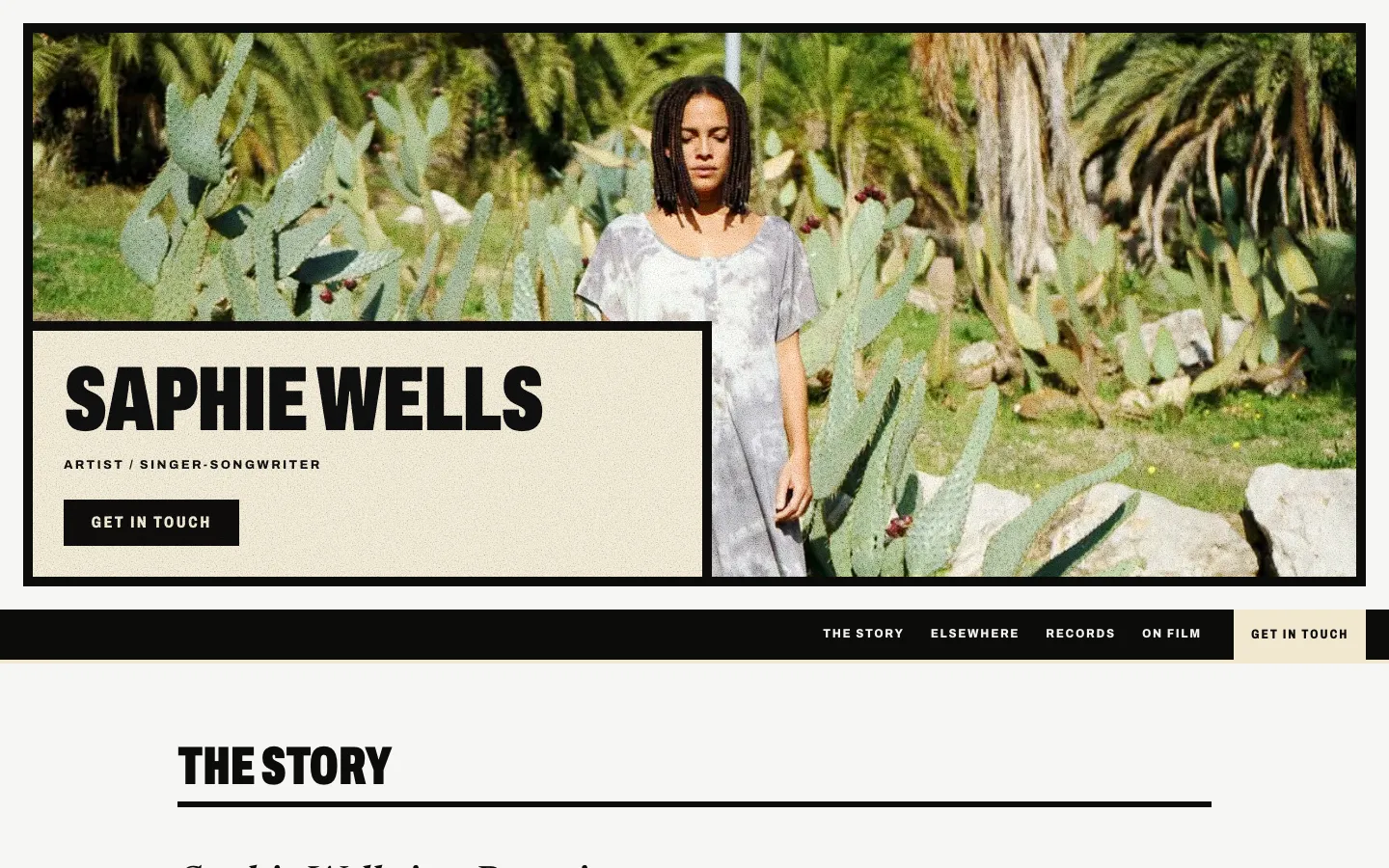
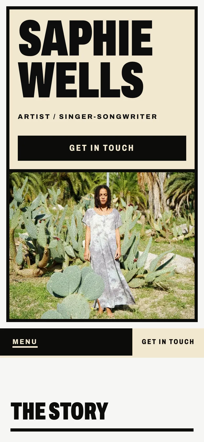
The main button on Saphie Wells's front page says "Get in touch", and it takes you to her contact. At the end of her menu there is a second button with the same words. It stays in sight on every page, on a phone too. Saphie is a Peruvian singer-songwriter based in Amsterdam, and she let us use her site for the examples in this post.
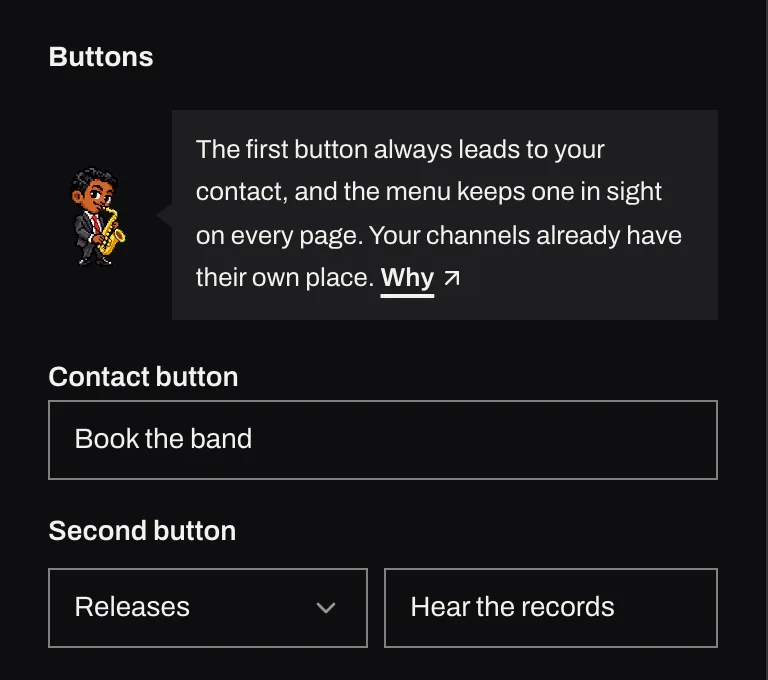
Every site in Pages now works this way. The CTA on your front page always leads to your contact. If your site has the Contact block, the menu gets its own button that goes there. You can add a second CTA that leads to another block on the same page, such as your dates, your records or your videos. No CTA can send the visitor away from your site any more. This post explains why we decided it this way and what the decision rests on.
What your site is for
Think about who actually opens your site. People who follow you already listen to you on the streaming services and follow you on social media, and that is usually where they go. Someone who arrives at your site often searched your name or clicked a link someone sent them, and more often than not they want something from you. That might be a venue, a festival, an agency or a journalist. It might be a couple planning their wedding, or a school looking for a teacher.
When someone searches your name, your YouTube channel and your profiles already show up. Your site can do one thing they can't: turn a visit into an offer, whether that's a date, a commission or an interview. That gives the CTA on your front page a single job. It takes whoever came to book you to the place where they can.
A CTA that leads out is a visit that leaves
A CTA at the top of your site that says "YouTube" or "Instagram" does exactly what it promises and takes the visitor away. They land on a platform built to keep them watching, and when your video ends it will suggest another musician's. You did the work to bring them to your site, from writing your name right to publishing your dates. All of it now pays off in someone else's house.
Your channels still matter, and they already have a place: the Links block and your Marquee, at the address /links. The CTA shouldn't compete with them.
Your CTA
- Book us
- Book a date
- Ask for a quote
- Book a lesson
Better in Links
- YouTube
- Spotify
- Follow me
Where people look for contact
Nielsen Norman Group is a consultancy that has studied how people use websites for decades. Its guidance on contact pages (“Contact Us” Page Guidelines, by Anna Kaley, 2019) draws on usability tests and eyetracking research. When people want a way to get in touch, they look at the top right corner of the page or scroll down to the footer. The advice is to put a noticeable contact link in the main navigation and in the footer, and to call it what it is. People trying to reach a company looked for the words "contact us", not "help" or "resources".
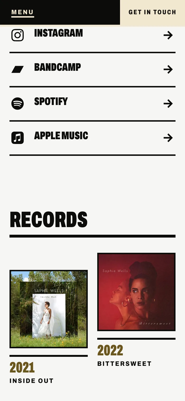
That is what your site's menu does now. Contact has a button of its own at the end of the menu, set apart from the other entries, and on a phone it never folds into the drop-down.
What about Google?
It's worth being exact here. Google doesn't penalise a site whose CTA leads to YouTube, and we have found no evidence that it does. The main argument is the one above: what your site is for, and who comes to it.
What Google does document is how it picks sitelinks. These are the shortcuts that sometimes appear under a result when someone searches your name. According to its documentation on sitelinks, sitelinks are automated: its systems analyse a site's link structure to find useful shortcuts. It recommends a logical structure, links to your important pages from other pages, and link text that is short and says where it leads. A "Contact" in the menu of every page fits that description. Nobody can guarantee a shortcut, but this makes one easier.
When something else would make sense
Sometimes the first thing you want from a visitor isn't a message. Almost all of those cases fit in Pages without breaking the rule:
- When "contact" is not the word. If you teach, play weddings or have an agency that books you, the CTA still leads to your contact, in your own words: "Book a lesson", "Ask for a quote", "Write to my agency".
- When you have just released a record. The hero's New release layout is made for this. It puts the sleeve and where to listen at the top.
- When you have shows coming up. The second CTA can lead to your dates, and each date leads to its tickets.
- When you want people to hear or see something. The second CTA can lead to your records or your videos without leaving your site.
The one thing left out is CTAs that point to other websites. Your channels, your streaming services and your shops have their place in Links.
How it works in Pages
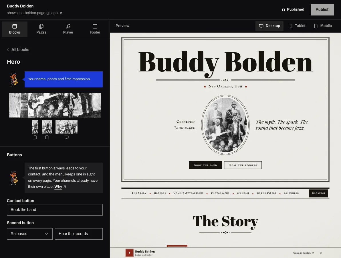
- The CTA always leads to your Contact block, and if that block is on another page, it leads to that page. Write whatever words you like. If you leave it empty, it shows the block's title. In Studio it is called "Contact button".
- The second CTA is optional and leads to another block on the same page. If you don't give it words of its own, it shows that block's title.
- The menu has its own contact button on every page, the blog included, and on a phone it stays in sight beside the menu.
- Without a Contact block, or when the block has no way to reach you, there is no CTA and no menu button. A button that leads to an empty block would be a broken promise. If the block is missing, Studio tells you.
If your site already had CTAs that led elsewhere, they no longer show. The first now leads to your contact and shows the block's title. The second is hidden until you choose a block for it. You change both in Studio, in the Hero block, and Dex reminds you there.
To see what else a booker checks on your site, read on with what a booker looks for on your site.
Your site, without the website work. Ask for your invitation.
Pages is the site and the Studio for musicians by The Jazz Passport. The technical side is done; you bring the music.